
Farul Haziq · case study
17 million members needed an i-Akaun they'd use.
redesigning EPF's member account on web and app.
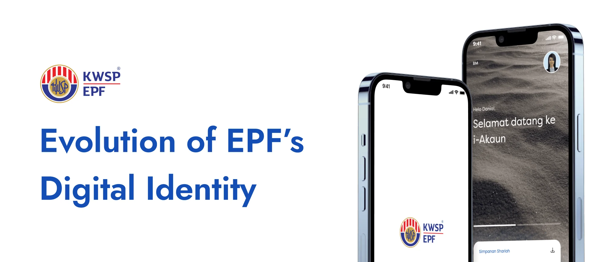
the brief
why it existed
The problem
i-Akaun is how EPF members, workers in Malaysia saving for retirement, manage their savings. but engagement was low: the design was dated, many tasks still needed paperwork or a branch visit, and members couldn't see how their savings were tracking.
The goal
make i-Akaun the easy way to check balances, contribute, apply for withdrawals and update details, on any device.
My part
- owned and designed modules, including the self-contribution flow and the FAQ page, across web, app and responsive screens.
- contributed to, maintained and evolved the Figma components, so web and app stayed consistent.
- ran user research and stakeholder interviews to inform design decisions.
- shaped the redesign with personas, landscape analysis and workshops.
the journey
how it actually went

-

Step 1 · workshop
Everyone in one room
before any sprint, i co-ran a design workshop with designers, developers and EPF stakeholders, to agree on the vision.
-

Step 2 · research
Hearing from members
interviews with 18 members and a survey of 415, then journey maps to find where the experience broke.
-

Step 3 · insights
Slow, and hard to find
members said the old app was slow, and many didn't know they could contribute from it. the feature was almost hidden.
-

Step 4 · sprints
12 sprints, 36 modules
9 design sprints and 3 support sprints, from login and statements to withdrawals, housing and i-Invest.
-
Step 5 · handover
Teaching EPF's own team
a Figma workshop i co-ran, plus tutorial videos, so EPF's designers could keep improving it after launch.
the mess in between
what we were up against
-

many stakeholders, many opinions. keeping the design standard high while aligning them all was the hardest part.
-

a direction only won with strong reasons behind it, backed by data and real member feedback.
-
a lot of legacy flows had to stay. we proposed shorter, simpler versions of some, but they didn't make the cut, to save development time.
the work
before and after
-
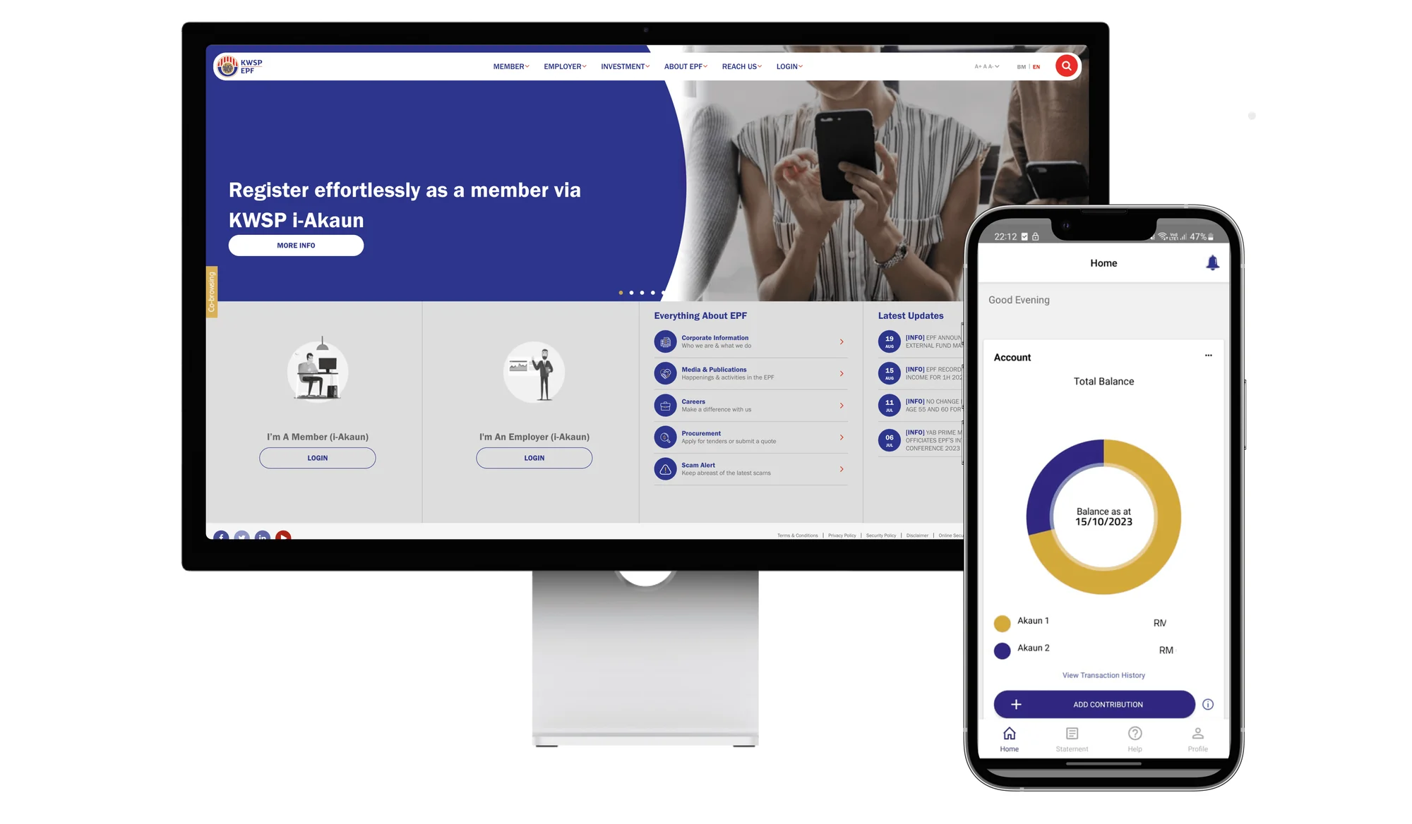
before: the old i-Akaun on web and app
Before the redesign
- a dated design that was hard to use, and engagement was low.
- many tasks still sent members to paper forms or a branch.
- little sense of how their retirement savings were tracking.
-
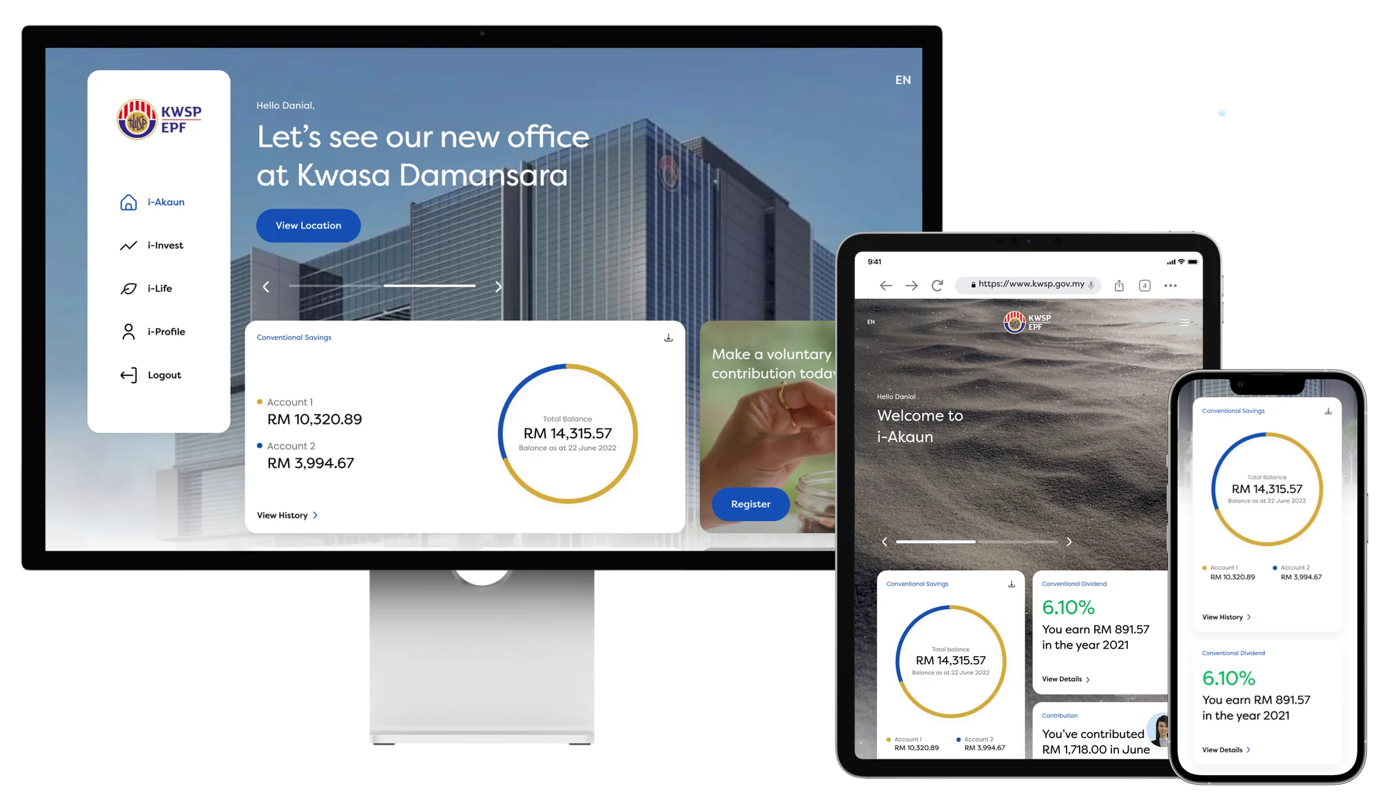
after: one design across desktop, tablet and phone
After the redesign
- one look across desktop, tablet and phone, designed mobile first.
- both accounts and the total balance at a glance.
- a "make a voluntary contribution" card on the home screen, which opens the self-contribution flow i designed.
- dividends and contributions in plain sentences, like "you earn RM891.57 in the year 2021".
- built on Providence, the design system made for the redesign.
-

three kinds of cards, to help members decide
Cards that help members decide
- action cards: quick tasks, like a house withdrawal or downloading a statement.
- financial cards: dividends, balances and how savings are growing.
- content cards: guides and products, like how to manage retirement funds.
the work
the system behind it
-

the foundation: Provident Blue and Provident Gold
The foundation
- logo, colour, type, grid and shadows: the core of EPF's digital identity.
- Provident Blue for buttons, icons and other interactive parts.
- Provident Gold, taken from EPF's logo, as the second colour.
-

components, with every state in one place
Components
- one file as the source of truth for every component in the library.
- each component shown in all its states, like this side navigation bar.
- i contributed to, maintained and evolved these, so web and app stayed consistent.
-

an icon library, with a guide for new ones
Icons
- a set of icons for i-Akaun's features, in one consistent style.
- a guide for creating new icons, so the set can grow without drifting.
the calls
the decisions behind it
-
Mobile first
the most common complaint was the slow app, so we started there: designed for mobile first, then built the web around it.
-
Make it easy to find
members didn't know self-contribution existed in the app. i brought it to the front, with a card right on the home screen.
-
Built to be handed over
a design system, documentation, an icon library and Figma training, so EPF's team could carry it on after launch.
the outcome
what changed
- +28% more online contributions, made in the self-contribution flow i designed
- 2.5× more time spent in the app, per session
measured over 6 months, for the whole redesign our team delivered with EPF. it's live for members on the web, Google Play and the App Store.
reflection
what I'd tell past me
"bring patience, and more evidence than you think you need."