
Farul Haziq · case study
Standard Chartered needed one design language.
the audit, the Figma library, and the community that kept it in use.
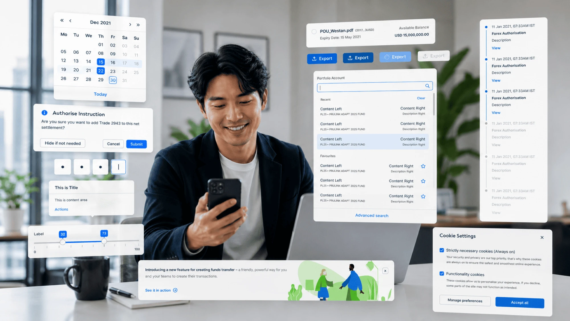
the brief
why it existed
The problem
UI design and development across the bank was fragmented, inconsistent and costly: siloed teams, duplicated effort, repetitive work, and a mix of open-source libraries driving up cost.
The goal
one set of design principles, best practices and a shared toolbox, so every product spoke the same design language across the bank's channels.
My part
- built the Figma component library: 44+ components, with variants and auto layout.
- wrote the documentation for 40 components and 11 patterns.
- named the design tokens with the front-end developers, so design and code used the same names.
- reviewed product designs built with the system for accessibility and correct component use.
- ran user research and stakeholder interviews to inform design decisions.
- ran the monthly design system community events.
the journey
how it actually went

-

Step 1 · audit
Where the products drifted apart
buttons, inputs and dropdowns shared colours, not shapes or sizes, and none came from a library. so we ranked components by use, and built the most common first.
-

Step 2 · interviews
What designers actually needed
from Figma newbies to Figma wizards: naming and onboarding mattered most, and finding things was the constant worry.
-

Step 3 · landscape
How other systems do it
studied HSBC, DBS Canopy, Westpac GEL, Goldman Sachs, Material, Carbon, GitLab and Ant. none fit as-is, so we built for our own users.
-

Step 4 · beta test
In designers' hands first
tested whether the components and names made sense. it led to clearer names, a faster workflow and a support channel.
-
Step 5 · community
Keeping it alive
i ran the monthly community events. plus a Slack channel of 30+ designers and stakeholders, and a retro every quarter.
the mess in between
what we were up against
-
there was a UX team, but no design system team. every designer worked on a different product, so the designs drifted apart.
-
even the buttons didn't match: same colour, but different shapes and sizes from product to product.
-
the design language itself was old, so even the newer products already looked dated.
the work
what actually shipped
-
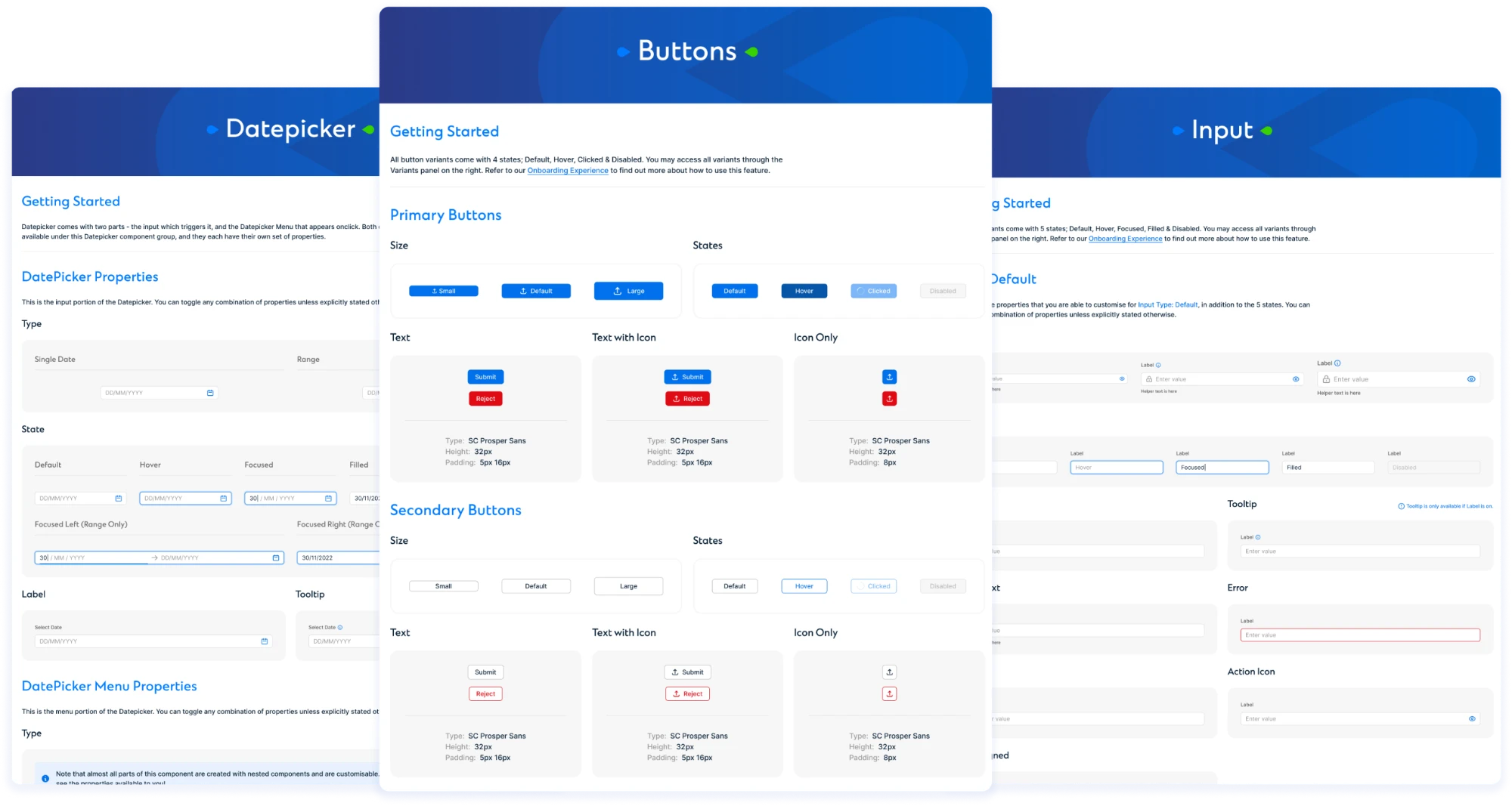
the UI kit: 44+ components, built with variants and auto layout
The UI kit in Figma
- 44+ components, built with variants and auto layout.
- the most-used came first: buttons, inputs and dropdowns.
- components are split into smaller parts that designers combine, instead of a variant for every case.
- removing hidden layers took the file from over 90% of Figma's memory to under 50%.
-
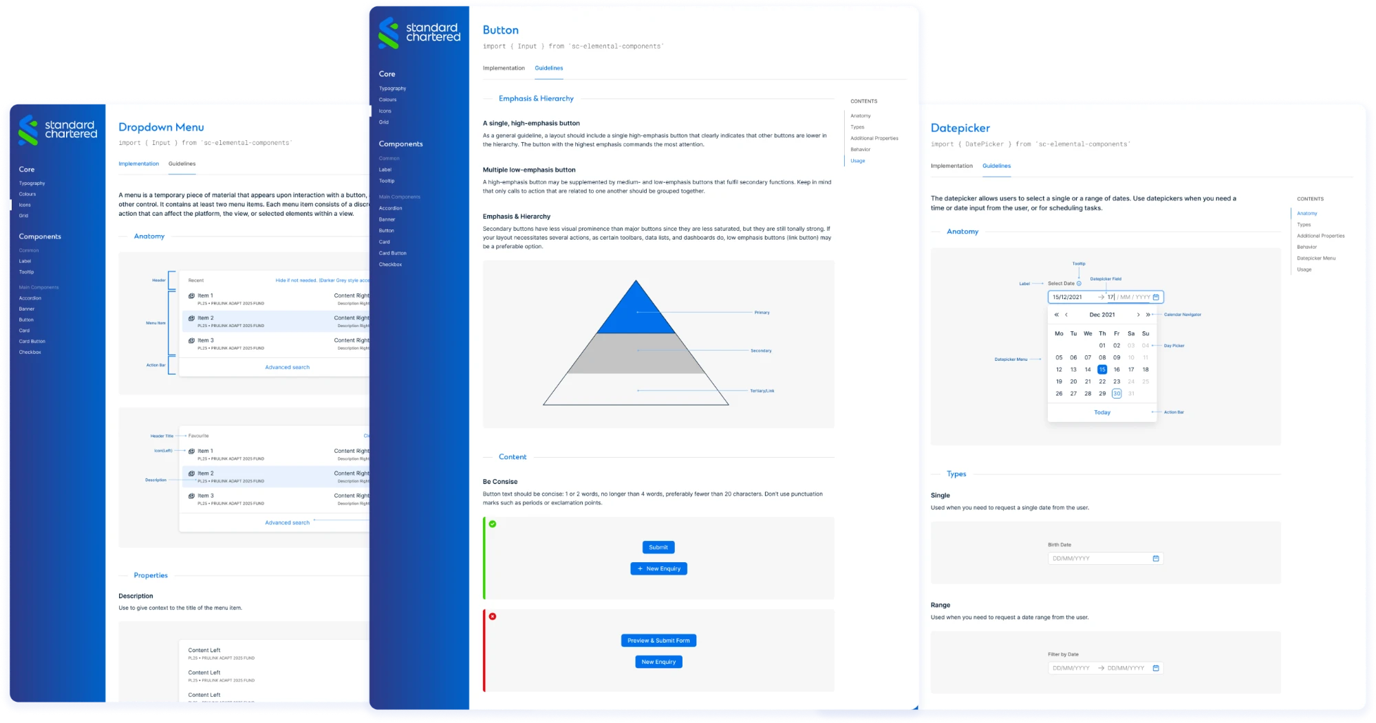
40 components, each with its own documentation
A page for every component
- 40 components, each documented on its own page.
- each page covers the anatomy, emphasis and hierarchy, and when to use it.
- names match the design tokens the front-end developers use.
- written for every designer, from Figma newbies to Figma wizards.
-
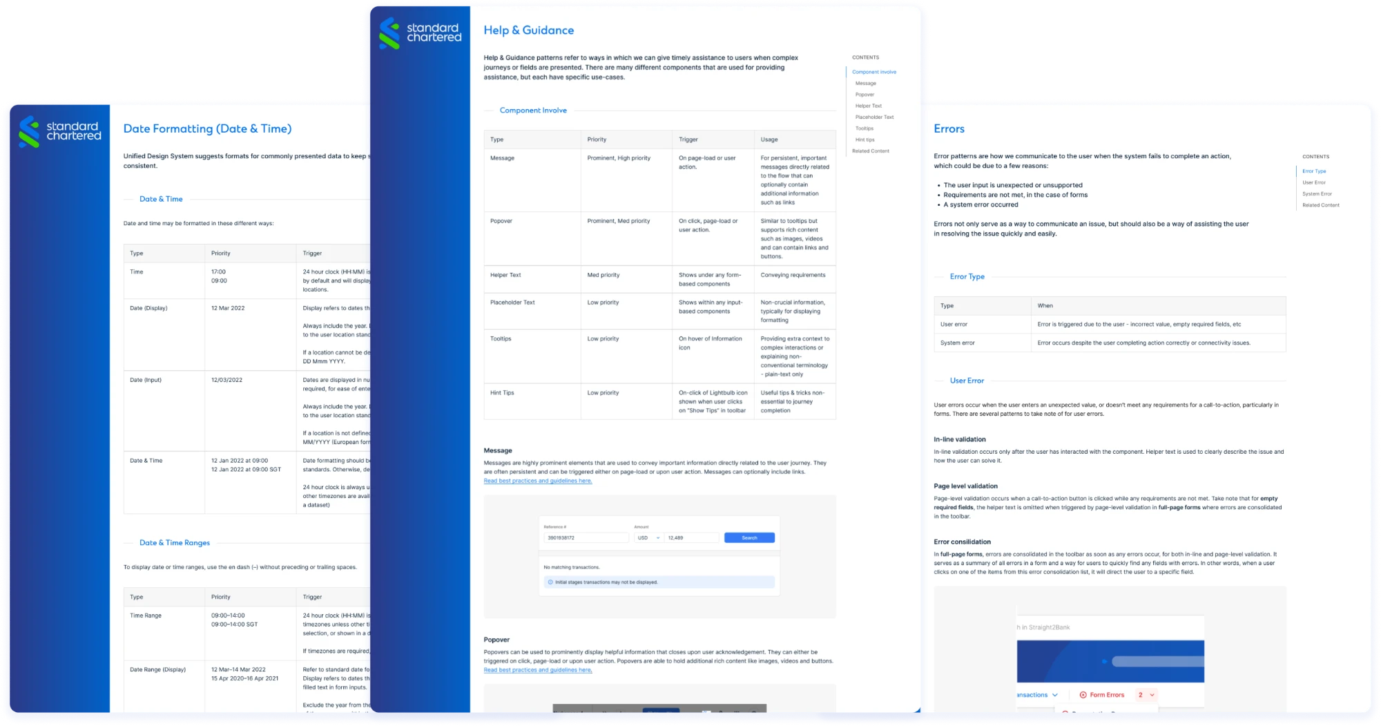
11 patterns, documented for the first time
Patterns, written down
- 11 patterns, such as data formatting, help and guidance, and error states.
- before, each product handled these its own way.
- we reviewed product designs against them for accessibility and correct component use.
the calls
the decisions behind it
-
Small parts, not endless variants
the audit found the same component built again and again. we kept one, and broke it into smaller parts that designers combine, instead of a variant for every case.
-
A library light enough to use
the file was using over 90% of Figma's memory. we removed the hidden layers and swapped variants for those smaller parts, and got it under 50%.
-
Names developers could use
i named the design tokens with the front-end developers, so a component in Figma and the same component in code had the same name.
the outcome
what changed
- 69% more successful logins in a 30-day test of the redesigned login
- 24% fewer clicks on "need help?" in the same test
- 10 projects using the system
the login was redesigned by the product team with our components. as the design system team, we reviewed it for accessibility and correct component use. developers also told us design and build both got faster: no hard number, just what we kept hearing.
reflection
what I'd tell past me
"i'd start with the hardest component first, to win stakeholder buy-in early."